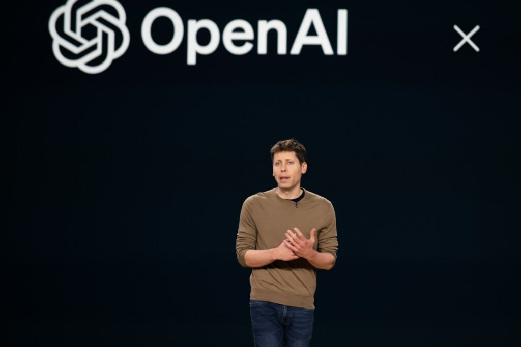
OpenAI may be undergoing some big changes next year, possibly including a new logo. However, when company members got a glimpse of the new logo’s concept design at an organizational meeting, they apparently weren’t too impressed with the logo. In this new logo, the hexagonal flower symbol of the company, which is recognizable thanks to the popularity of ChatGPT, is gone. Instead, the symbol is replaced with a large black “O” or a simple ring or circle, which the staff reportedly found uncreative and even ominous.
The new logo is the complete opposite of OpenAI’s current logo, which was designed with a focus on “accuracy, potential, and optimism,” according to how Fortune magazine’s sources described it. Apparently, the company began a logo redesign a year ago after hiring new people for its in-house design and creative team.
The reason for OpenAI company’s decision to redesign the logo
Fortune says one of the reasons OpenAI is going for a brand new look is that it doesn’t currently have a typeface for its logo and website. In fact, this company may seek to establish its identity by becoming a household name.
Fortune also previously reported that OpenAI will change its complex nonprofit structure next year. The company started out as a non-profit company, but apparently needed to become a for-profit organization in order to raise more capital.
OpenAI CEO Sam Altman has reportedly told employees that the company is moving away from its non-profit structure and becoming a traditional for-profit company. In any case, if the company’s leaders listen to employee feedback, the new OpenAI will come with a different logo; Not a logo that even the personnel themselves consider to be ominous.
RCO NEWS


